The London Olympics start in a month but McDonalds began their own
Olympics earlier this month with 
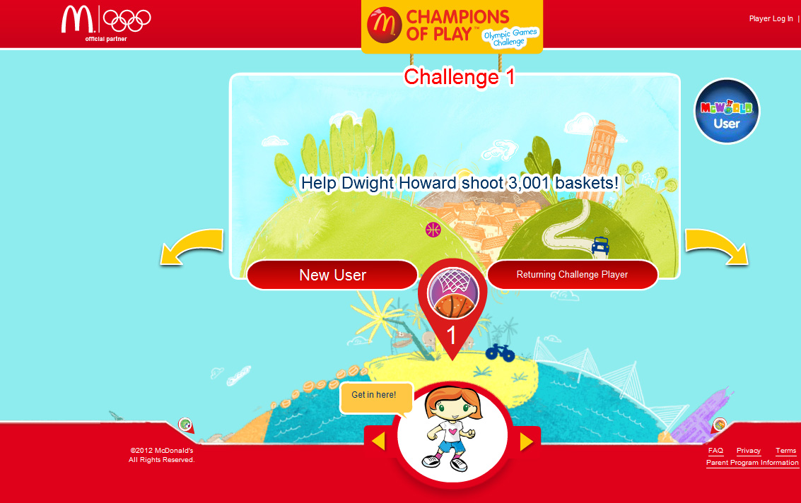
Champions of Play, a global program
designed around the Olympics. It's intended to promote kids' wellness by
encouraging physical activity and healthy nutrition. Our illustrator,
Caroline Attia, created all the art for both the print and interactive
aspects of the campaign. She created delightful, whimsical backgrounds
incorporating international landmarks, and much of the art is on the
Champions of Play web site. Caroline also designed a 14 page accordion
piece to go with 70 million Happy Meals.
Showing posts with label ADVERTISING. Show all posts
Tuesday, June 26, 2012
Wednesday, June 20, 2012
DAHL TAYLOR KICKS THE SUMMER OFF RIGHT
We take pride in the strong
relationships we build with our clients, so it gives us great pleasure to share
a sampling of the work we’ve recently done with our good friends at Boston Beer.
Their in-house creative team has transformed the package design for some of the USA’s
finest domestic brews, and we feel extremely fortunate to be a part of the collaboration.
![]() |
Art Director: Matt Moffatt | Designers: Joe Dion & Jim Dumas | Label illustrations: Dahl Taylor
Variety pack illustrations: Bernard Maisner
|
Wednesday, April 25, 2012
GIRL POWER!
Recently, three great female talents from our group have been assigned to ad campaigns directed toward women. Each artist employs her personal style to create an advertisement that the target audience can truly identify with.
Propaganda hired Bunky Hurter to illustrate the multicultural faces of Crystal Light's new Mocktails mix. Bunky designed five diverse women to personify each flavor; margarita, mojito, pomtini, peach bellini, and appletini.
CLICK HERE TO VIEW MORE WORK FROM BUNKY HURTER'S PORTFOLIO
Feminine and elegant, Kate Forrester applied her signature lettering style to an Always campaign commissioned by Leo Burnett. Using bold colors, the illustrations tell the story of empowered teenage girls, no longer distressed by their monthly period (thanks to Always).
CLICK HERE TO VIEW MORE WORK FROM KATE FORRESTER'S PORTFOLIO
Publix called on Mona Daly to illustrate an in-store poster that reads, "Gorgeous On The Go!" The advertisement features a beautiful, energetic 30-something woman shopping for Unilever products. Below are more examples of Mona's ability to portray strong, confident women.
CLICK HERE TO VIEW MORE WORK FROM MONA DALY'S PORTFOLIO
Tuesday, April 3, 2012
DAHL TAYLOR'S NEW LOOK
Dahl Taylor has been cooking up a new style and we're thrilled to share it with you! A complement to his traditional work, this body incorporates montage elements such as scanned pencil drawings, patterns, found objects, and hand lettering. Constructed in Photoshop, the various components are then re-sized and enhanced to achieve a vintage effect. Below the first illustration are the ingredients that make up its composition.

![]() |
| DETAIL 1 |
![]() |
| DETAIL 2 |
![]() |
| DETAIL 3 |
![]() |
| DETAIL 4 |
![]() |
| DETAIL 5 |
![]() |
| DETAIL 6 |
Monday, March 12, 2012
DIGITAL PROGRESSION: IT'S ALL IN THE NAME
Recently, we started working with a phenomenal UK-based CGI group called Digital Progression. Run by Malcolm Tween & Robert Farnworth, this multifaceted studio is capable of a wide range of work including product, technical, environmental, animation, and the list goes on...
Below is a work-through for one of over 250 images Digital Progression created for the Santander XTY campaign.
CLICK HERE TO VIEW MORE WORK FROM DIGITAL PROGRESSION'S PORTFOLIO
Below is a work-through for one of over 250 images Digital Progression created for the Santander XTY campaign.
CLICK HERE TO VIEW MORE WORK FROM DIGITAL PROGRESSION'S PORTFOLIO
![]() |
| Step 6: The final advertisement |
![]() |
| Step 5: Final image |
![]() |
| Step 4: Final rendered objects. Additional people were placed in and the water around the guitar, shadows and reflections were retouched. |
![]() |
| Step 3: Wire frame placement of the guitar and a positional render of the camera. The scene was replicated in 3D to match the perspective, lighting and environment. |
![]() |
Step 2: The image of the beach is retouched to remove footprints, people, rocks etc. The image is color corrected and a different sea added in. |
![]() |
| Step 1: The original un-retouched photograph is selected. |
Subscribe to:
Comments (Atom)


