Tuesday, September 4, 2012

D is for DUERDEN

Our awesome artist Neil Duerden lives in a world of energy, motion, and technicolor. He is well know for his vibrant, hip 3D illustrations (see Wonka image on right) and has developed an impressive client list, including Amazon, Samsung, Sony, Powerade, Wonka, and BMW. Fortunately, Neil brings the same vivacity and passion to his artistic process, which we are excited to share here in this Mendola Exclusive!

Recently, Neil received several requests for "heavily rendered text," so decided to promote his 3D text skills with a unique discipline. Neil challenged himself to create 26 pieces in the span of 2 weeks; each piece would represent a single letter of the alphabet (as in: A is for Apple) and would represent one of Neil's typographic styles. As Neil notes, this alphabet can serve as a style indicator and source of reference for Art Directors worldwide.

Although Neil's alphabet site isn't complete yet, we are excited to share some preview images here!


"H is for Hair"
"V is for Van"


"TYPOGRAPHY:
26 Letters Created in 2 Weeks"


Always developing his style, Neil has also created several independent test images for L'Oreal, Ford, and xBox360. We are so proud to have such a prolific and talented artist on our Mendola team!


CLICK HERE to see more of Neil's work: http://www.mendolaart.com/portfolio/0/132/0/neil_duerden/0/

Wednesday, August 8, 2012

One new artist... Two new styles!

We are proud to welcome a fantastic new artist, Jude Buffum, to our team at Mendola! With Jude, we get two strong styles--8-Bit/Pixel and Info Graphic--wrapped into one. Both styles command attention and delight the eye... a killer combination!

Jude's 8-Bit/Pixel work pays homage to classic video games, such as Super Mario Brothers and Pac Man. His pixelated characters may play tennis and bowl (see "The Dude" on the right), but they remain flatly pressed against an ever-present computer screen. Jude repeatedly references pop culture and cult movies, including The Big Lebowski and rapper T-Pain's Auto-Tuned music.


CLICK HERE for Jude's 8-Bit/Pixel Portfolio           CLICK HERE for Jude's Info Graphic Portfolio

Despite his clear affinity for modern culture and technology, Jude also displays an affection for low-tech image-making: namely, cross-stitching. In this traditional art form, needle and thread are used to create small X stitches on linen. These cross-crosses optically mix to create one image, say, of a cat or a bundle of flowers.

Jude applies this idea to computer graphics, which also rely on the optical mixture of small patterns (i.e. square pixels). He blurs the line between high technology--video games--and low technology--cross-stitching. This effect can have chilling consequences. "Juego Terminado" ["Game Over"], for instance, depicts a classic Day of the Dead skull, smiling simultaneously in traditional threads and modern pixels. We are not sure which game has ended--the game of life or hand-made crafts?


At first glance, Jude's alternate style, Info Graphics, appears to convey cut-and-dried mechanical and scientific information. However, his content is rarely so serious. One of his images breaks down how a cat stores nine lives in its intestines; another shows how a leprechaun (living a slot machine/robot body, no less) would mix a bowl of Lucky Charms. Silly ideas have never been explained so well, and clear information has never been more fun.

We look forward to sharing more of Jude's work with you soon!


Tuesday, June 26, 2012

CAROLINE ATTIA FOR MCDONALDS CHAMPIONS OF PLAY

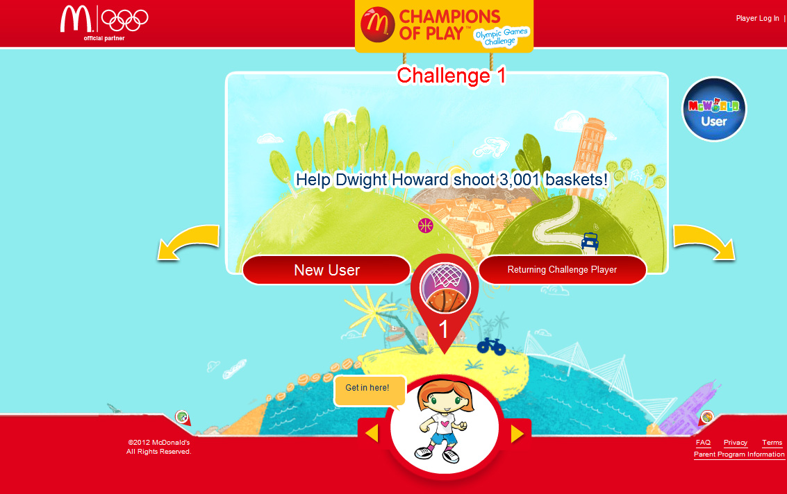
The London Olympics start in a month but McDonalds began their own Olympics earlier this month with Champions of Play, a global program designed around the Olympics. It's intended to promote kids' wellness by encouraging physical activity and healthy nutrition. Our illustrator, Caroline Attia, created all the art for both the print and interactive aspects of the campaign. She created delightful, whimsical backgrounds incorporating international landmarks, and much of the art is on the Champions of Play web site.  Caroline also designed a 14 page accordion piece to go with 70 million Happy Meals.


Wednesday, June 20, 2012

DAHL TAYLOR KICKS THE SUMMER OFF RIGHT

We take pride in the strong relationships we build with our clients, so it gives us great pleasure to share a sampling of the work we’ve recently done with our good friends at Boston Beer. Their in-house creative team has transformed the package design for some of the USA’s finest domestic brews, and we feel extremely fortunate to be a part of the collaboration.

Boston Beer has produced a limited edition Samuel Adams IPA Hop-logy variety pack containing an assortment of beers adorned with labels illustrated by Dahl Taylor. For Dahl, this mix pack is the culmination of an ongoing project and it was exciting to see how well the labels coordinate. Dahl combines his eclectic style, a dash of humor and exceptional drawing skills, giving each bottle the appearance of a relic. Coincidentally, the case for the pack was hand-drawn in chalk by Bernard Maisner, an artist from our affiliate, Gerald & Cullen Rapp.

        Art Director: Matt Moffatt | Designers: Joe Dion & Jim Dumas | Label illustrations: Dahl Taylor
Variety pack  illustrations: Bernard Maisner


Wednesday, April 25, 2012

GIRL POWER!

Recently, three great female talents from our group have been assigned to ad campaigns directed toward women. Each artist employs her personal style to create an advertisement that the target audience can truly identify with.

Propaganda hired Bunky Hurter to illustrate the multicultural faces of Crystal Light's new Mocktails mix. Bunky designed five diverse women to personify each flavor; margarita, mojito, pomtini, peach bellini, and appletini.
CLICK HERE TO VIEW MORE WORK FROM BUNKY HURTER'S PORTFOLIO


Feminine and elegant, Kate Forrester applied her signature lettering style to an Always campaign commissioned by Leo Burnett. Using bold colors, the illustrations tell the story of empowered teenage girls, no longer distressed by their monthly period (thanks to Always).
CLICK HERE TO VIEW MORE WORK FROM KATE FORRESTER'S PORTFOLIO 


Publix called on Mona Daly to illustrate an in-store poster that reads, "Gorgeous On The Go!" The advertisement features a beautiful, energetic 30-something woman shopping for Unilever products. Below are more examples of Mona's ability to portray strong, confident women.
CLICK HERE TO VIEW MORE WORK FROM MONA DALY'S PORTFOLIO 


Tuesday, April 3, 2012

DAHL TAYLOR'S NEW LOOK

Dahl Taylor has been cooking up a new style and we're thrilled to share it with you! A complement to his traditional work, this body incorporates montage elements such as scanned pencil drawings, patterns, found objects, and hand lettering. Constructed in Photoshop, the various components are then re-sized and enhanced to achieve a vintage effect. Below the first illustration are the ingredients that make up its composition.


DETAIL 1
DETAIL 2


DETAIL 3
DETAIL 4


DETAIL 5
DETAIL 6