Friday, December 7, 2012

Delicious Holiday Designs!

'Tis the season for delicious holiday designs! Easier said than done these days. The challenge with holiday packaging is hinting at Christmas without being too obvious.
 
Debbie Powell found the right balance in her work with Amy Knapp Design, creating several whimsical patterns for Peet's Coffee's holiday packaging. Debbie developed holiday patterns with a tribal twist. She supplied the final artwork in black and white, and Amy Knapp added color.
 
Debbie's illustration/design style seems to be particularly popular with specialty food companies. We've posted a few other winners below.
 
CLICK HERE for Debbie Powell's portfolio.


Monday, November 26, 2012

Andrey Gordeev joins the ranks!

We're pleased to introduce Andrey Gordeev, the newest member of the Mendola Artists team!
 
Andrey is widely known throughout eastern Europe as an award-winning illustrator, and we are excited to introduce him to the American market.

Andrey specializes in kids, publishing, character development, and humorous ad campaigns.

CLICK HERE for Andrey Gordeev's portfolio.


Monday, November 12, 2012

Delightfully Distracted... by Studio Distract!

"Boy and the Dinosaur"

With great pride, we'd like to welcome Studio Distract to Mendola Artists!
 
Studio Distract is a 3D animation development/production studio that creates work for both TV and film. They use high-end CGI, grounded in strong visual design and storytelling, to create projects that are both appealing and commercially successful.
 
Studio Distract develops original intellectual properties, works from pre-existing properties, and creates co-productions. Their many clients have included Disney, Hallmark, and DHX Media, as well as local governments and charities.
 
We are thrilled to have Studio Distract join our team and we can't wait to see what they do next!


"Little Animals"
"Gabby and Gator"
 
"Rollie and Friends"

Thursday, November 1, 2012

All the Right Ingredients


Mary Woodin was recently commissioned by Tesco to help rebrand their upmarket range of fresh soups, giving them an "as-good-as-homemade" look. Her brief was to scatter the ingredients around the package, as though they were on a kitchen table waiting to be chopped. Mary used watercolor to capture the look and feel of the fresh, whole ingredients used in these products.

First, Mary gathered her subjects--carrots, peas, squash, tomatoes, beans, etc.--from her very own vegetable garden! Next, she painted the ingredients in sections and layered them in Photoshop. This allowed her to focus on depicting the individual characteristics of each vegetable, rather than trying to fit them within a prescribed area. It also provided maximum flexibility for the packaging designer. Afterwards, Mary added a color wash to each background, creating cohesion between the ingredients and differentiating between the assorted recipes.

Once again, Mary showcases her ability to capture the beauty and detail of Earth's natural forms.


Monday, October 22, 2012

Steven Bonner 'Just Does It' Best

There's nothing better than an iconic slogan in a fresh style!
 
Our artist Steven Bonner was recently commissioned by Nike to create two apparel designs featuring the Airmax 95 sneaker and Nike's iconic 'Just Do It' slogan. Steven worked closely with art director Christopher DeGaetano, who requested urban graffiti-inspired designs. Steven crafted both the lettering and product in a dynamic dripping liquid style, which he has perfected in recent years.
 
As Steven explains, "With a style like this one, the designs have to be allowed to grow organically and can't be too prescribed, otherwise they lose the natural quirks that make them work."
 
Steven's work is an interesting hybrid of typography and illustration. Projects include logo design, expressive type designs, package design, and book and magazine covers.
 
CLICK HERE for Steven Bonner's portfolio.


Steven's final Airmax 95 illustration
Steven's initial Airmax 95 and "Just Do It" sketches


Monday, October 15, 2012

Mona Daly's Safeway Silhouettes


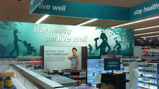
Several months ago, Mona Daly was commissioned by Safeway to create a series of in-store signage using her signature silhouette style. Since then, she has created over eight store banners, beacons, end caps, and posters, which will rotate seasonally. In fact, she's working on new store signage for the Holidays as we speak!
 
Mona was asked to create several images depicting health, wellness, and family life, as well as cultural seasons, such as "back to school" and "fall football." Safeway encouraged her to show dimension by using multiple tones of a single color. They also asked her to keep details limited and to maintain a sense of brightness and vibrancy within every image. As you can see, Mona executed these challenges perfectly!
 
In the blue banner above, Mona illustrated health and wellness within a group of multigenerational people in various outdoor activities. She left room for text in the middle of the image, which Safeway filled with "Stay healthy and live well." By transitioning from a large foreground figure to smaller background figures and from darker to lighter tones, Mona was able to capture a strong sense of depth. The final 7x25 foot poster (right) now hangs proudly in Safeway stores around the country!  
 
In the red banner below, Mona illustrated a family using life's essential products in the home. As her thinking and images developed (see sketches below), she rearranged the figures, added detail and context.
 
 
Overall, Mona's collaboration with Safeway has been a great success! Safeway has been very pleased with the illustrations and continues to give Mona new assignments. As for Mona, she is thrilled to have had the opportunity to take her silhouettes to the next level!
 
CLICK HERE for Mona Daly's portfolio.


Friday, September 21, 2012

A Whole New World with Tom Newsom


Our artist Tom Newsom is well known for traditional paintings of Santa, workshop elves, and snowy banks. Over the years, he has created over 150 Santa images (see several below). But he recently created this sample with contemporary kids, and we're excited to share it with you!
 
As Tom says, "In an illustration, you can create any kind of a world you want." He began this sample with the inspiration to place contemporary kids in a fantastical adventure on a unknown planet. He used local neighborhood kids as models and  dropped them into an alternate-universe situation where everything was the wrong size (akin to Jack entering a giant's home atop a beanstalk).
 
Tom made sure each item in the room was different and interesting, adding touches like an antique harmonica and bronze statue. And, as you may notice, the globe does not actually depict earth; instead, it shows the landscape of Mars--a far-future Mars--in which "terraforming" has produced oceans. With Tom Newsom, you get a whole new world!
 
CLICK HERE to see Tom's complete portfolio.


Monday, September 17, 2012

Scandalous: The Musical

Our artists at Digital Progression just created the poster for Scandalous: The Musical, a new Broadway show! We are excited to share with you this exclusive information about their creative process:

Digital Progression, a CGI studio, was originally asked to create an image of a hand and apple on a very bright, almost surrealistic, sky (see: Magritte). Through phototography, photo illustration, and CGI, they created this incredible poster (right).

First, they mocked up the hand in 3D, so they could explore different hand shapes, finger positions, lighting, and camera angles. Once this was approved by the show's producers, they shot a series of hands with a placeholder apple.


Then, they combined several of the shots and altered the finger positions until they had the perfect 'seductive' hand shape, and afterwards finished it with cosmetic retouching and lighting correction.

The apple was actually shot separately, so the artists could alter the size, color, and lighting. The bite was created from five separate shots, so they could control the placement and make the perfect shape.

Then, Digital Progression added the apple and hand to a sky background, which they composited from 20 different cloud/sky shots. The final image is a medley of layers, allowing Digital Progression to easily adapt it for different formats and purposes.
Finally, the "Scandalous" logo text was built and rendered in 3D CGI. They tried a couple of versions where the apple replaced the "C", but ultimately settled on the image featured at the top.

According to the official Scandalous website: "Scandalous is the new musical based on the life of Aimee Semple McPherson, the world's first media superstar evangelist, whose passion for saving souls equaled her passion for making headlines. Set in 1920s Los Angeles, holiness collides with Hollywood in the extraordinary tale of one woman's charismatic rise to fame amidst scandalous love affairs and growing controversy, inevitably ending in her much-publicized fall from grace."

The show previews on October 10 and opens on November 15, so be sure to grab your tickets now!

CLICK HERE for more by Digital Progression.

Monday, September 10, 2012

Epic sagas call for epic collaborations...

Our artist Hugh Syme recently completed a fantastic collaboration with Canadian rock band Rush. Hugh is responsible for the cover art on their newest (and nineteenth!) album, Clockwork Angels (2012), as well as the images inside the album's accompanying novel, and the cover art for Rush's subsequent tour book.

In fact, Hugh is responsible for most of the band's artwork over the last 36 years, since he's the band's art director, designer, illustrator, and principal image maker. This partnership between the visual arts and music has proven the importance of interdisciplinary collaboration.

Hugh's work with Rush began in 1975 with the cover for Caress of Steel (1975). But his most iconic contribution may be the band's logo--the "Starman" emblem--which Rush fans adopted after its original appearance on the 2112 album (1976). Hugh has also created cover art for Aerosmith, Megadeth, Styx, Def Leppard, Dream Theater, Celine Dion, Bon Jovie, Iron Maiden, and QueensrΓΏche, but he is forever associated with Rush's epic sagas.

Hugh's work on Clockwork Angels began nearly two years ago, after Rush recorded their first two songs for the album. The band immediately began the Time Machine tour in 2010, during which they leaked these two songs, "BU2B - Brought Up to Believe" and "Caravan." But the remainder of the album remained unwritten, unrehearsed, and unrecorded for nearly a year. When the Time Machine tour entered it's second phase in 2011, Hugh began to delve deeply into the concepts for the album's packaging.

Originally, Hugh and Rush drummer Neil Peart wanted Clockwork Angels' cover to be urban and edgy, so they drew inspiration from the British tag/graffiti artist Banksy. But as time passed, the tone and imagery for the album developed and took on a life of its own. Still liking the original art, Hugh and Neil decided to use it for the cover of the tour book, which accompanies what one might call the third part of the Time Machine tour: their much anticipated upcoming Clockwork Angels tour in September, 2012.


Now, Hugh's redesigned, reimagined work can be seen on Clockwork Angels' album cover and on/in its accompanying book. The album debuted at #1 in Canada and at #2 on the Billboard 200 chart. Neil Peart recently released an essay describing the band's process and illuminating the partnership with Hugh in particular:
 
"So once again, collaboration proves joyful, and elevates the art. This project has been sparked by many sources of flint and steel, and one quality shared by everyone involved might be called 'a fevered imagination.' That temperament, burning slightly hotter than what passes for 'normal,' also describes art director Hugh Syme—who is serving a life sentence as my graphic arts collaborator. Hugh brings his own febrile dreams to the Vision Quest, and whatever I can visualize, he can realize. The two-year (literally elephantine) gestation period of this album allowed Hugh time to generate a series of beautifully evocative paintings to accompany the story—the words and music."

 
We are so proud to have supported Hugh throughout his lifelong collaboration with Rush. We anticipate many more wonderful things from Hugh and Rush, and we can't wait to see, hear, and experience them all!

CLICK HERE for more of Hugh's work: http://www.mendolaart.com/portfolio/0/63/0/hugh_syme/0/

Wednesday, September 5, 2012

US Open Poster Champion... Michael Crampton!

 
The Circus (a.k.a. the US Tennis Open) is in the Big Apple this week, and our very own Michael Crampton created the poster and program art! This is quite an achievement, akin to winning the actual tournament. The preliminary draw featured a large pool of talent submitting ideas. He was up against stiff competition in the finals, including a few of his own ideas (see below). But, in the end, it was game, set, and match for Michael with his fantastic design celebrating tennis and New York City.
 
Michael's initial sketches


Submissions to the US Open poster competition had four main requirements:

~ Convey that the US Open is an entertainment spectacle;
~ Convey that the event takes place in New York, but is international;
~ Include the US Open flaming ball logo;
~ Be iconic and exciting!

We are delighted to share these initial sketches and alternates with you, as well as the final poster image.

To learn more about the US Open, go to www.usopen.org.

And look out for Michael's image, which can be found on posters, street banners, and T-shirts all around the world!


Alternate poster (B)
Alternate poster (A)


--
--
Ultimately, the panel picked the fantastic image featured here: link. Huge congrats, Michael!!

For more work by Michael Crampton, CLICK HERE: http://www.mendolaart.com/portfolio/0/67/0/michael_crampton/0/0